When a potential customer lands on your website or picks up your product, they make a judgment call before they read a single word. In fact, studies show that up to 90% of snap judgments made about products can be based on color alone.
Color is not just an aesthetic choice left to the whims of a graphic designer. It is a language. It is a biological signal. It is a powerful, non-verbal communication tool that hacks directly into the human subconscious.
At Verve, we don't just pick colors that "look nice." We pick colors that work. Here is the science behind why your palette matters more than you think.
1. The Science of the First Impression
The human brain processes visual data 60,000 times faster than text. Before your customer understands what you sell, they feel how you sell it.
This is the Psychology of Color: the study of how hues determine human behavior.
If your financial consultancy uses neon pink and lime green, you are subconsciously signaling "chaos" and "immaturity," regardless of how professional your copy is. Conversely, a muted navy blue signals "stability" and "authority" without saying a word. Your palette sets the stage for the conversation before it even begins.
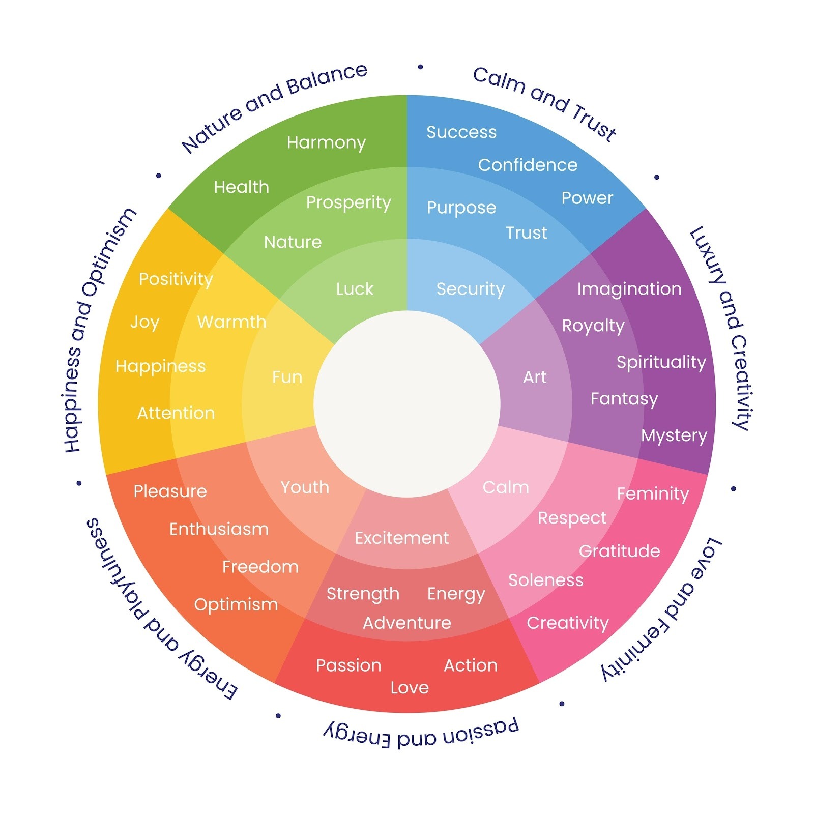
2. Decoding the Spectrum: What Are You Really Saying?
Different wavelengths of light trigger different emotional responses. While context matters, there are universal associations that successful brands leverage to influence behavior.
Shutterstock
Blue: The Trust Builder
- The Vibe: Security, logic, peace, reliability.
- Who uses it: Banks (Chase), Tech Giants (Facebook, Intel), Healthcare.
- The Strategy: If you need users to trust you with their data or their money, blue is the gold standard.
Red: The Pulse Raiser
- The Vibe: Urgency, passion, energy, hunger.
- Who uses it: Fast Food (McDonald's), Clearance Sales (Target), Media (Netflix).
- The Strategy: Red physically raises the heart rate. Use it to stimulate appetite or create a "fear of missing out" (FOMO) on a call-to-action button.
Green: The Growth Signal
- The Vibe: Health, wealth, serenity, nature.
- Who uses it: Whole Foods, Android, Financial Services (Fidelity).
- The Strategy: Green is the easiest color for the eye to process. It signals that a brand is eco-friendly or fiscally sound.
Black: The Luxury Statement
- The Vibe: Sophistication, exclusivity, substance.
- Who uses it: Apple, Chanel, Mercedes-Benz.
- The Strategy: Black absorbs light and attention. It signals that the product speaks for itself and needs no flashy distractions.
3. Strategy Beyond the Primary Color
A strategic color palette isn't just about picking one dominant hue; it's about the relationship between colors.
- The Isolation Effect: We use accent colors to direct behavior. If your website is primarily cool blue, a bright orange "Sign Up" button (the complementary color) becomes impossible to ignore.
- Brand Consistency: Color increases brand recognition by 80%. When we define a palette, we are building a visual asset. Think of "Coca-Cola Red" or "Tiffany Blue"—the color is the brand.
The Bottom Line
Your brand's colors are doing heavy lifting every second of the day. They are either building trust and guiding users toward a purchase, or they are creating cognitive dissonance that sends them running to a competitor.
Don't leave your palette to chance. By treating color as a strategic asset rather than a decoration, you can influence customer emotion, establish your identity, and ultimately drive results.
Related posts
The "Vector-First" Paradox: Why AI Logos Fail the Scale Test
.gif)
The 60-Second Superpower: How Custom Explainer Animation Beats Video for Complex Tech

The Inclusivity ROI: Why AODA/ADA Compliance is Your Best SEO Strategy

Introduction
Mi tincidunt elit, id quisque ligula ac diam, amet. Vel etiam suspendisse morbi eleifend faucibus eget vestibulum felis. Dictum quis montes, sit sit. Tellus aliquam enim urna, etiam. Mauris posuere vulputate arcu amet, vitae nisi, tellus tincidunt. At feugiat sapien varius id.
Eget quis mi enim, leo lacinia pharetra, semper. Eget in volutpat mollis at volutpat lectus velit, sed auctor. Porttitor fames arcu quis fusce augue enim. Quis at habitant diam at. Suscipit tristique risus, at donec. In turpis vel et quam imperdiet. Ipsum molestie aliquet sodales id est ac volutpat.

Elit nisi in eleifend sed nisi. Pulvinar at orci, proin imperdiet commodo consectetur convallis risus. Sed condimentum enim dignissim adipiscing faucibus consequat, urna. Viverra purus et erat auctor aliquam. Risus, volutpat vulputate posuere purus sit congue convallis aliquet. Arcu id augue ut feugiat donec porttitor neque. Mauris, neque ultricies eu vestibulum, bibendum quam lorem id. Dolor lacus, eget nunc lectus in tellus, pharetra, porttitor.
"Ipsum sit mattis nulla quam nulla. Gravida id gravida ac enim mauris id. Non pellentesque congue eget consectetur turpis. Sapien, dictum molestie sem tempor. Diam elit, orci, tincidunt aenean tempus."
Tristique odio senectus nam posuere ornare leo metus, ultricies. Blandit duis ultricies vulputate morbi feugiat cras placerat elit. Aliquam tellus lorem sed ac. Montes, sed mattis pellentesque suscipit accumsan. Cursus viverra aenean magna risus elementum faucibus molestie pellentesque. Arcu ultricies sed mauris vestibulum.
Conclusion
Morbi sed imperdiet in ipsum, adipiscing elit dui lectus. Tellus id scelerisque est ultricies ultricies. Duis est sit sed leo nisl, blandit elit sagittis. Quisque tristique consequat quam sed. Nisl at scelerisque amet nulla purus habitasse.
Nunc sed faucibus bibendum feugiat sed interdum. Ipsum egestas condimentum mi massa. In tincidunt pharetra consectetur sed duis facilisis metus. Etiam egestas in nec sed et. Quis lobortis at sit dictum eget nibh tortor commodo cursus.
Odio felis sagittis, morbi feugiat tortor vitae feugiat fusce aliquet. Nam elementum urna nisi aliquet erat dolor enim. Ornare id morbi eget ipsum. Aliquam senectus neque ut id eget consectetur dictum. Donec posuere pharetra odio consequat scelerisque et, nunc tortor.
Nulla adipiscing erat a erat. Condimentum lorem posuere gravida enim posuere cursus diam.
Related posts
Lorem ipsum dolor sit amet, consectetur adipiscing elit.
Blog title heading will go here
Blog title heading will go here
Blog title heading will go here
Contact us
Let's make something great together.
Keep Connected