
If you’ve spent any time on the web lately, you’ve seen it: the "Corporate Clean" look. It’s a world of rounded sans-serif fonts, vibrant but safe pastels, and perfectly symmetrical layouts. It’s efficient, it’s readable, and in 2026, it’s officially boring.
As AI models have perfected the art of the "optimal" interface, they’ve inadvertently created a sea of sameness. When every brand looks like a tech startup, the only way to stand out is to break the rules.
Enter Anti-Design: a gritty, raw, and intentionally "human" rebellion against the algorithm.
The Death of "Perfect" UX
For years, the goal of design was to be invisible. We wanted interfaces so smooth they felt like they weren't even there. But for Gen Alpha and late-Gen Z, "invisible" feels like "inauthentic."
These audiences are growing up in an era of deepfakes and AI-generated polish. They have developed a biological "cringe response" to anything that feels too manufactured. They aren't looking for a perfect grid; they are looking for a soul.
Why "Gritty" is the New "Premium"
Anti-Design isn't about making things ugly; it’s about making them honest. We are seeing a massive shift toward aesthetics that AI struggles to replicate convincingly:
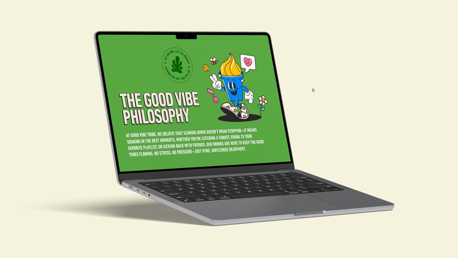
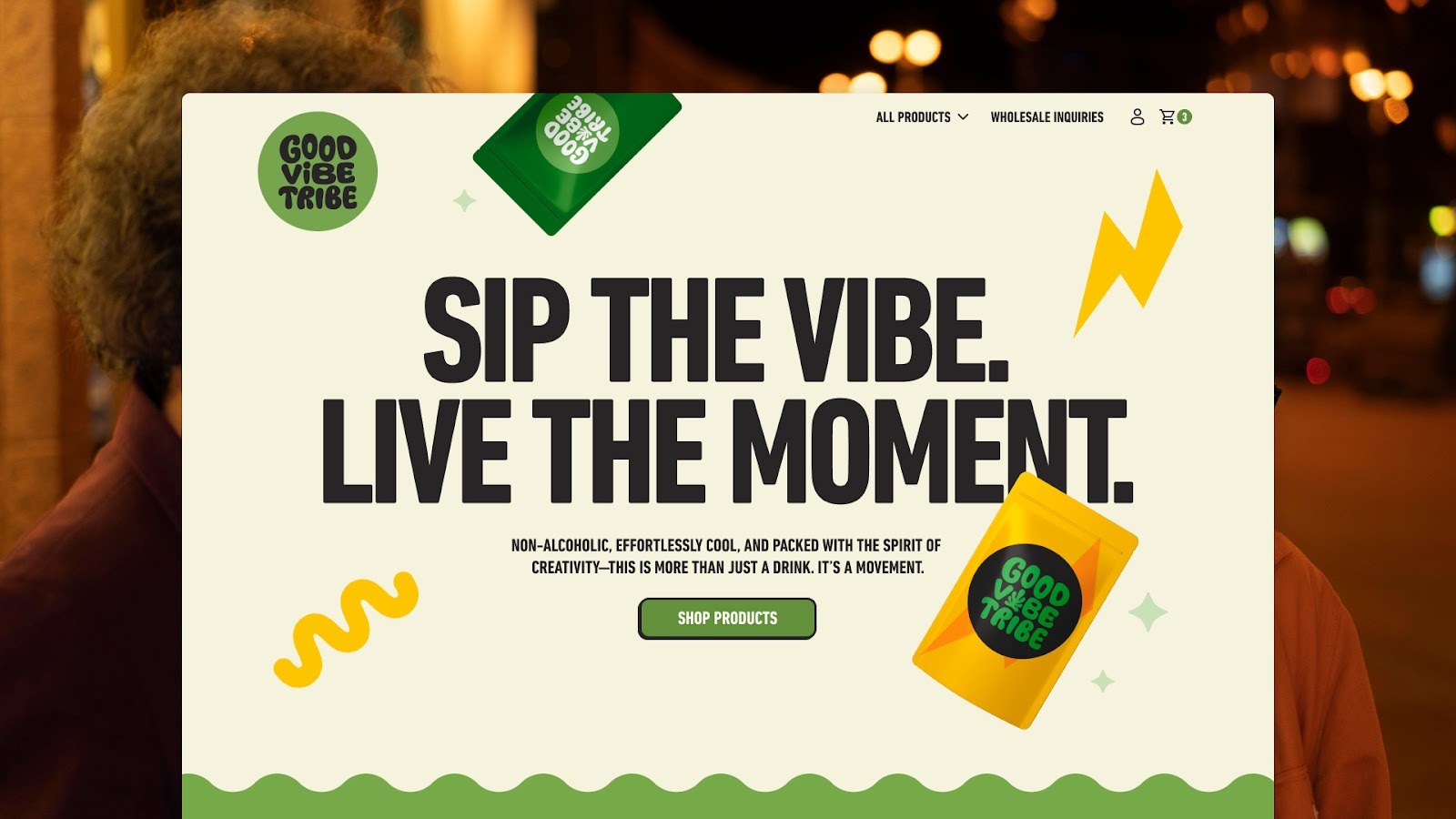
- Hand-Drawn Elements: Think erratic sketches, hand-written typography, and "doodle" borders. These signal that a human—not a prompt—was behind the screen.
- Tactile Textures: Digital designs are ditching flat colors for grain, paper textures, and film burn. It gives the screen a physical, "analog" weight.
- Brutalist Layouts: Breaking the grid. Overlapping text, unconventional navigation, and "harsh" hierarchies that demand attention rather than fading into the background.
The Psychology: Why It Works
Why does a "messy" design convert? It’s rooted in the Psychology of Scarcity.
In 2026, flawless symmetry is a commodity. It’s cheap to produce and easy to automate. Conversely, a design that feels "unoptimized" suggests a brand that is confident enough to ignore the "Best Practices" handbook. It creates a sense of exclusivity and subculture—the digital equivalent of a DIY punk flyer in a world of glossy billboards.
Designing for 2026: The Disruptor’s Playbook
If your brand wants to capture the next generation of consumers, you have to stop designing for the algorithm and start designing for the rebel.
The Rule of Thumb: If an AI can generate your entire UI layout in one prompt, you’re already behind the curve.
At Verve Studios, we’re helping brands lean into this "Anti-Corporate" shift by blending high-performance Webflow functionality with raw, custom-crafted visual identities. We ensure that while the aesthetic feels rebellious, the performance remains elite.
Related posts
The "Vector-First" Paradox: Why AI Logos Fail the Scale Test
.gif)
The 60-Second Superpower: How Custom Explainer Animation Beats Video for Complex Tech

The Inclusivity ROI: Why AODA/ADA Compliance is Your Best SEO Strategy

Introduction
Mi tincidunt elit, id quisque ligula ac diam, amet. Vel etiam suspendisse morbi eleifend faucibus eget vestibulum felis. Dictum quis montes, sit sit. Tellus aliquam enim urna, etiam. Mauris posuere vulputate arcu amet, vitae nisi, tellus tincidunt. At feugiat sapien varius id.
Eget quis mi enim, leo lacinia pharetra, semper. Eget in volutpat mollis at volutpat lectus velit, sed auctor. Porttitor fames arcu quis fusce augue enim. Quis at habitant diam at. Suscipit tristique risus, at donec. In turpis vel et quam imperdiet. Ipsum molestie aliquet sodales id est ac volutpat.

Elit nisi in eleifend sed nisi. Pulvinar at orci, proin imperdiet commodo consectetur convallis risus. Sed condimentum enim dignissim adipiscing faucibus consequat, urna. Viverra purus et erat auctor aliquam. Risus, volutpat vulputate posuere purus sit congue convallis aliquet. Arcu id augue ut feugiat donec porttitor neque. Mauris, neque ultricies eu vestibulum, bibendum quam lorem id. Dolor lacus, eget nunc lectus in tellus, pharetra, porttitor.
"Ipsum sit mattis nulla quam nulla. Gravida id gravida ac enim mauris id. Non pellentesque congue eget consectetur turpis. Sapien, dictum molestie sem tempor. Diam elit, orci, tincidunt aenean tempus."
Tristique odio senectus nam posuere ornare leo metus, ultricies. Blandit duis ultricies vulputate morbi feugiat cras placerat elit. Aliquam tellus lorem sed ac. Montes, sed mattis pellentesque suscipit accumsan. Cursus viverra aenean magna risus elementum faucibus molestie pellentesque. Arcu ultricies sed mauris vestibulum.
Conclusion
Morbi sed imperdiet in ipsum, adipiscing elit dui lectus. Tellus id scelerisque est ultricies ultricies. Duis est sit sed leo nisl, blandit elit sagittis. Quisque tristique consequat quam sed. Nisl at scelerisque amet nulla purus habitasse.
Nunc sed faucibus bibendum feugiat sed interdum. Ipsum egestas condimentum mi massa. In tincidunt pharetra consectetur sed duis facilisis metus. Etiam egestas in nec sed et. Quis lobortis at sit dictum eget nibh tortor commodo cursus.
Odio felis sagittis, morbi feugiat tortor vitae feugiat fusce aliquet. Nam elementum urna nisi aliquet erat dolor enim. Ornare id morbi eget ipsum. Aliquam senectus neque ut id eget consectetur dictum. Donec posuere pharetra odio consequat scelerisque et, nunc tortor.
Nulla adipiscing erat a erat. Condimentum lorem posuere gravida enim posuere cursus diam.
Related posts
Lorem ipsum dolor sit amet, consectetur adipiscing elit.
Blog title heading will go here
Blog title heading will go here
Blog title heading will go here
Contact us
Let's make something great together.

Keep Connected